Display Function
This guide will walk you through the process of creating and implementing custom display functions.
Various attribute types possess distinct value types, each with its own specialized data structure. While some attribute types may share the same value types, every value type requires a unique display function capable of handling its specific data structure.
This guide is limited to attributes of type question and matgroup sharing the same value types.
Create a Vue Component
Attributes are rendered using VUE Components that are registered as display functions. Based on the attribute type that is being rendered, Expivi passes the attribute data to the registered component (see Architecture).
The data passed to the view component includes essential information such as the attribute's label, current value selected, available items for selection, loading state, preferred size, and more.
This structured data provides the component with all the necessary details to render the attribute.
Provided Data Structure
Data passed to the view component is as follow:
{
    label: string,// The name of the attribute
    value: number|string,// The current value selected
    items: { // Possible values for user to select from
      id: number|string,// Value's id
      label: string,// Name
      description: string,// Description
      thumbnail: string|null,// Url to thumbnail
      color: string|null,// Preferred background color e.g. #FFFFFF
      price: number|null,// Decimal number for price
      visible: boolean,// If value is visible
      disabled: boolean,// If value should be disabled
      filtered: boolean,// If value is filtered out
      categories: string[]// Value's categories
    }[],
    loading: boolean,// If the controller is loading
    size: 'sm'|'lg',// Preferred size by user
    rounded: 'yes'|'no',// Preferred rounded corners
    node_id: number,// The id of the attribute
}
The above data structure is passed as properties to the display function of attribute types question and matgroup.
Returning the Selected Value
To ensure seamless interaction between the component and the configurator, it's essential to emit events with the selected value.
By emitting an 'input' event with the selected value's ID, the component communicates the user's selection back to the application, enabling the configurator to apply the chosen values accordingly.
this.$emit('input', this.items[0].id);
Example Implementation
To illustrate the concepts discussed, let's consider an example component: CheckboxSelectorView.
This component is designed to handle attributes containing exactly two values. It renders a checkbox, with the first value selected if the checkbox is unchecked and the second value selected if the checkbox is checked.
Through methods and watchers, the component dynamically updates its state based on user interactions and emits the selected value to the parent component, facilitating seamless integration within the configurator.
const CheckboxSelectorView = {
    template: `
<div>
    <input type="checkbox" :id="'checkbox_group_'+node_id" v-model="selected" />
    <label :for="'checkbox_group_'+node_id">{{label}}</label>
</div>
    `,
    data() {
        return {
            selected: false
        }
    },
    props: {
        label: String,
        value: {
            default: null
        },
        items: Array,
        loading: {
            default: false
        },
        size: {
            type: String,
            default: 'lg'
        },
        rounded: {
            type: String,
            default: 'no'
        },
        node_id: Number,
    },
    created () {
        this.updateCheckbox();
    },
    methods: {
        updateCheckbox(){
            this.selected = this.items.length > 0 && this.value != this.items[0].id;
        }
    },
    watch:{
        value(aNewValue){
            this.updateCheckbox();
        },
        selected(aNewValue){
            if(aNewValue && this.items.length > 1){
                this.$emit('input', this.items[1].id);
            }else if(this.items.length > 0){
                this.$emit('input', this.items[0].id);
            }
        }
    }
};
Configuring Display Functions
To use the created display function, the component must be registered in the attribute's configuration and within the options application.
Registering Custom Display Functions
To register the custom display function, the component has to be registered before instantiating the options application (ExpiviComponent).
The component should be registered on the ExpiviOptionsVueInstance.prototype.$customViews object.
e.g. registering the CheckboxSelectorView:
ExpiviOptionsVueInstance.prototype.$customViews["Checkbox"] = CheckboxSelectorView;
In above example the CheckboxSelectorView is registered as 'Checkbox'.
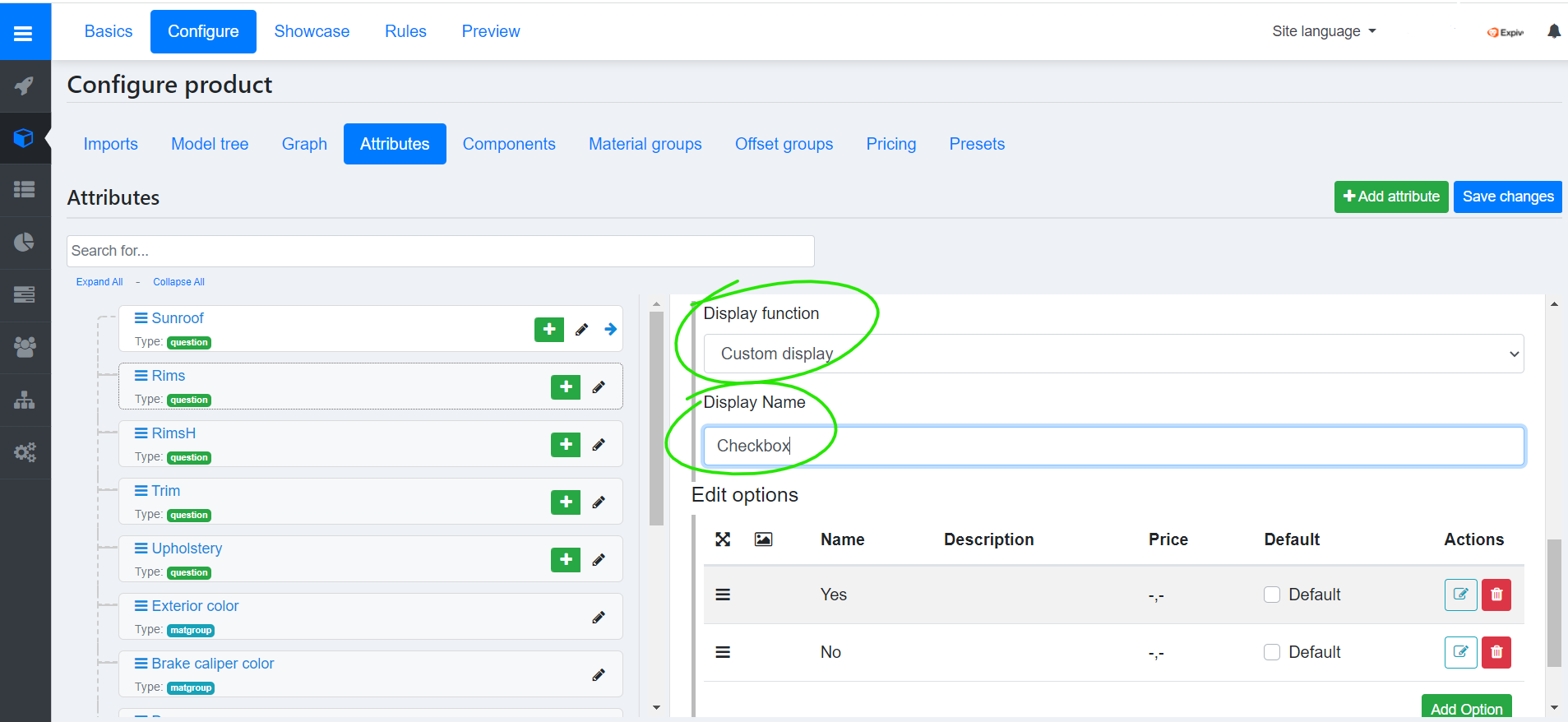
Configuring the Attribute Settings
To set the custom display function:
- Navigate to the attribute settings (Catalogue → Product → Configure → Attributes → Edit).
- Select 'Custom display' from Display function options.
- Enter the name of registered component in under Display name.
e.g. setting the custom display to Checkbox as e.g. provided in Configuring Display Functions: