Form builder
The form builder lets you design the questions a customer fills in when submitting a product request. Forms are built using a visual drag-and-drop editor and support a versioning system so you can iterate on a form without disrupting the live version.
A form you create here can then be attached to an offer configuration (Offer configurations) to make it available in the storefront.
Create a new form
- Open Site in the main navigation and select Form Builder.
- Click Create in the top-right corner.
- Fill in the General fields (see table below).
- Click Save.
General fields
| Field | What it does |
|---|---|
| Name | A clear and descriptive name for this form. Required. |
| Identifier | A unique, URL-safe code using only letters, digits, hyphens, underscores, and dots. Used to reference the form externally. |
| Status | Active makes the form available for selection in offer configurations. Inactive hides it from that selector. |
| Description | Free-text notes for your team. Not shown to customers. |
Create and edit a version
A form has no content until you add at least one version. Each version is a separate snapshot of the form layout. Only one version can be published at a time.
Create the first version
- Open the form you just created and locate the Editor section.
- Click Create Initial Version.
- Confirm the dialogue. An unpublished version appears in the table.
Add a new version
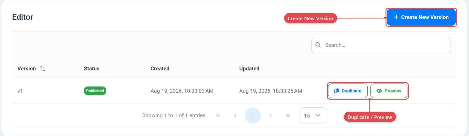
- In the Editor section, click Create New Version.
- Confirm the dialogue. The new version is created as a copy of the most recent version and appears with status Unpublished.
Open the visual editor
- In the version table, click Edit on any unpublished version.
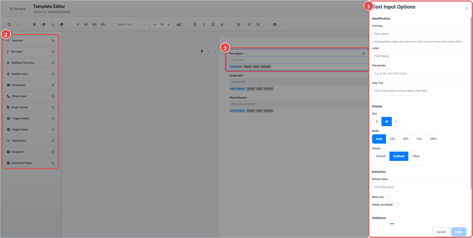
- The visual editor opens in a new view. Use the left panel to add fields to the canvas by clicking them or dragging them onto the layout.
- Click a field on the canvas to select it and adjust its settings in the right sidebar.
- Click Save in the header to save your changes without leaving the editor, or Save & Close to save and return to the form.
Published versions are read-only. Click Duplicate on a published version to create a new editable copy based on it.
Preview a version
Click Preview on any version that contains content to open a preview in a new browser tab. Preview is available for both published and unpublished versions that have at least one field.
Field types
The left panel in the editor lists all available field types. Click a field type or drag it onto the canvas to add it. The following field types are available.
| Field type | What it collects |
|---|---|
| Text Input | A single line of free text, such as a name or reference number. |
| Multiline Text Area | Multiple lines of free text, such as comments or a description. |
| Number Input | A numeric value, with optional min, max, step, and decimal settings. |
| Email Input | An email address, with optional domain allow-list or block-list validation. |
| Phone Input | A phone number in international or national format, with optional country filtering. |
| Toggle Switch | A true/false choice shown as an on/off switch, with configurable labels for each state. |
| Single Choice | A single selection from a list of options, displayed as radio buttons. |
| Multichoice | One or more selections from a list of options, displayed as checkboxes. |
| Dropdown | A single selection from a list of options, shown as a standard or searchable drop-down. |
| Date/Time Picker | A date, a time, or a combined date-and-time value, with optional min/max bounds. |
| Image Upload | One or more image files, with configurable file count, size, and dimension limits. |
Field options
When you click a field on the canvas, the right sidebar shows its options, divided into shared settings (present on every field) and settings specific to that field type.
Settings on every field
| Setting | What it does |
|---|---|
| Field Key | A machine-readable identifier for this field (lowercase letters, digits, and underscores). Required. Used as the key in the submitted data. |
| Label | The visible question or field name shown to the customer. Required. |
| Placeholder | Grey hint text shown inside the input before the customer types (not available on toggle, radio, or checkbox fields). |
| Help Text | A short description shown below the field to guide the customer. |
| Size | Visual size of the field. |
| Width | How wide the field appears in the layout (not available on toggle, radio, and multichoice fields). |
| Variant | Display style for the field (not available on toggle, radio, multichoice, and dropdown fields). |
| Default Value | A pre-filled value the customer can change or keep (not available on date/time fields, which have their own default value setting). |
| Read-only | When checked, the field is displayed but cannot be edited by the customer. |
| Hidden by default | When checked, the field is hidden from customers on load. |
| Required | When checked, the customer must fill in the field before submitting. Disabled automatically when the field is read-only or hidden. |
Text Input — additional settings
| Setting | What it does |
|---|---|
| Min Length | Minimum number of characters required. |
| Max Length | Maximum number of characters allowed. |
| Pattern (RegEx) | A regular expression the value must match on submission. |
| Trim whitespace before validation | When checked, leading and trailing spaces are stripped before the pattern and length checks run. |
Multiline Text Area — additional settings
| Setting | What it does |
|---|---|
| Min Length | Minimum number of characters required. |
| Max Length | Maximum number of characters allowed. |
| Max Lines | Maximum number of visible lines in the text area. Leave empty for automatic height. |
Number Input — additional settings
| Setting | What it does |
|---|---|
| Min Value | Lowest value the customer can enter. |
| Max Value | Highest value the customer can enter. |
| Step | Increment used by the stepper buttons. |
| Allow Decimals | When checked, decimal values are accepted. |
| Decimal Places | Number of decimal places allowed (visible only when Allow Decimals is on). |
Email Input — additional settings
| Setting | What it does |
|---|---|
| Max Length | Maximum number of characters allowed. |
| Allowed Domains | Comma-separated list of permitted email domains (for example company.com). Leave empty to allow any domain. When set, all other domains are blocked. |
| Blocked Domains | Comma-separated list of prohibited email domains. Cannot be combined with an allowed-domains list. |
Phone Input — additional settings
| Setting | What it does |
|---|---|
| Display Variant | International — shows a country-code prefix selector (for example +1 555-123-4567). National — local format only, requires a Default Country. |
| Default Country | Pre-selects a country in the phone input. Required when using the National variant. |
| Allowed Countries | Limits valid country codes to the selected countries. Available for the International variant only. |
Toggle Switch — additional settings
| Setting | What it does |
|---|---|
| True Label | Text shown next to the toggle when it is switched on (for example "Yes"). |
| False Label | Text shown next to the toggle when it is switched off (for example "No"). |
Single Choice — additional settings
Manage the list of options customers can choose from. Each option has an ID and a label. You must add at least two options.
Multichoice — additional settings
| Setting | What it does |
|---|---|
| Minimum Selected | Minimum number of options the customer must select. |
| Maximum Selected | Maximum number of options the customer can select. |
Also manage the list of options, each with an ID and a label.
Dropdown — additional settings
| Setting | What it does |
|---|---|
| Type | Standard Dropdown — a plain drop-down list. Searchable Dropdown — adds a search box so customers can filter long lists. |
| Max Visible Options | Maximum number of options visible in the dropdown without scrolling (Searchable Dropdown only). Leave empty for automatic height. |
Also manage the list of options, each with an ID and a label.
Date/Time Picker — additional settings
| Setting | What it does |
|---|---|
| Type | date — date only. time — time only. datetime — date and time together. |
| Default Value | A pre-filled date or time value shown when the form opens. |
| Minimum Date | Earliest selectable date (date and datetime variants only). |
| Maximum Date | Latest selectable date (date and datetime variants only). |
Image Upload — additional settings
| Setting | What it does |
|---|---|
| Max Files | Maximum number of images the customer can upload. |
| Max Size (MB) | Maximum file size per image in megabytes. Maximum allowed is 5 MB. |
| Min Width (px) | Minimum width in pixels for uploaded images. |
| Min Height (px) | Minimum height in pixels for uploaded images. |
| Max Width (px) | Maximum width in pixels for uploaded images. |
| Max Height (px) | Maximum height in pixels for uploaded images. |
| Aspect Ratio | Required aspect ratio for uploads, in width:height format (for example 16:9). |
Save and publish
Saving in the editor stores your layout changes to the unpublished version. You can save as many times as you like while the version is unpublished, saves are incremental and do not affect the live form.
Publishing a version makes it the active form that customers see. To publish:
- Return to the form's edit page (use Save & Close or the back button).
- In the Editor section, locate the version you want to publish.
- Click Publish and confirm the dialogue.
Publishing a version is permanent. A published version becomes read-only and cannot be edited. To make further changes, duplicate it into a new version.
Once a version is published, the form's Status must be set to Active and the form must be assigned to an offer configuration (Offer configurations) before customers can see it.