The template editor is a full-screen content editor you open from a template's edit page. It lets you combine formatted text, column layouts, and purpose-built blocks (images, shopping carts, configuration links, and more) into a finished template.
Opening the editor
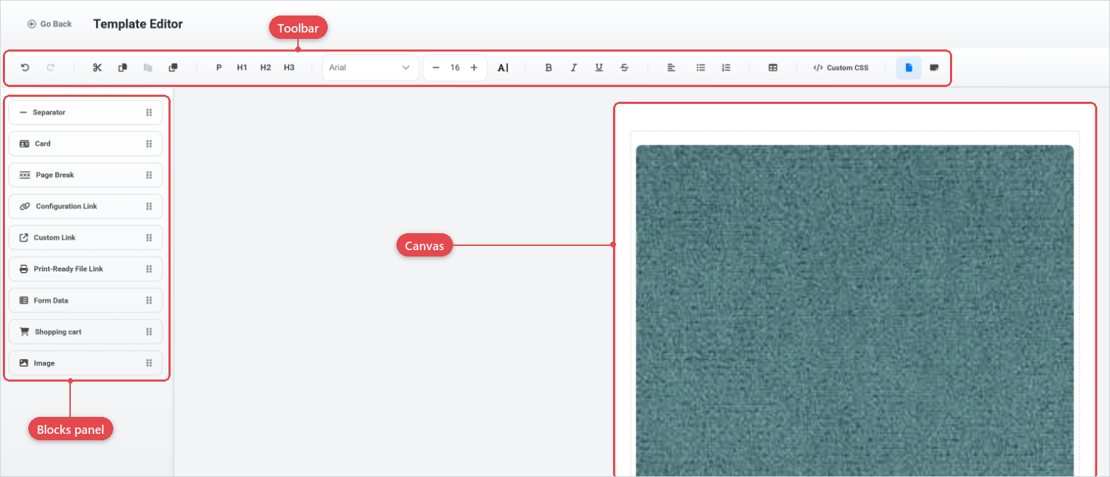
On the template edit page, scroll to the Template section and click Open Full-Screen Editor. The editor opens in a new view with:
- A toolbar along the top.
- A blocks panel on the left for inserting custom blocks.
- The canvas in the centre where you compose content.
- header action buttons (Save, Save and Close, Open Preview, Close) at the top right.
When a template has been published, the editor opens in read-only mode. Create a new template or edit a draft copy to make changes.
The toolbar is grouped into functional sections, separated by dividers.
History
| Button | What it does |
|---|
| Undo | Reverses the last action. |
| Redo | Re-applies the last undone action. |
Editing
| Button | What it does |
|---|
| Cut | Removes the selected content and copies it to the internal clipboard (preserving rich formatting). |
| Copy | Copies the selection to the internal clipboard. |
| Paste | Pastes the contents of the internal clipboard at the cursor. |
| Duplicate | Inserts a copy of the selection immediately after it. |
Text type
Applies a paragraph or heading style to the current paragraph.
| Button | Style applied |
|---|
| P | Normal paragraph |
| H1 | Heading level 1 |
| H2 | Heading level 2 |
| H3 | Heading level 3 |
Font
| Control | What it does |
|---|
| Font family dropdown | Changes the font family for the selected text. |
| Font size controls | Decrease / increase buttons and a click-to-select size list. |
| Text colour | Opens a colour picker to set the text colour of the selection. |
Text style
| Button | What it does |
|---|
| Bold | Toggles bold. |
| Italic | Toggles italic. |
| Underline | Toggles underline. |
| Strike | Toggles strikethrough. |
Text align
Click Text align to open the alignment menu.
| Option | Effect |
|---|
| Left | Aligns text to the left. |
| Right | Aligns text to the right. |
| Center | Centres text. |
| Justify | Justifies text across the full width. |
Lists
| Button | What it does |
|---|
| Bulleted list | Toggles an unordered list. |
| Numbered list | Toggles an ordered list. |
Insert Row
Click Insert Row to add a column-based layout row at the cursor. The canvas splits into the chosen number of columns; you can type or drop blocks into each column.
| Layout | Column widths |
|---|
| 1 Column | 100% |
| 2 Columns (Even) | 50% / 50% |
| 2 Columns (Left) | 33% / 67% |
| 2 Columns (Right) | 67% / 33% |
| 3 Columns (Even) | 33% / 33% / 33% |
| 3 Columns (Sidebars) | 25% / 50% / 25% |
| 4 Columns | 25% / 25% / 25% / 25% |
Custom CSS
Click Custom CSS to open a sidebar where you can write CSS rules that are applied to the rendered template output. Use this for fine-grained styling not covered by the built-in options.
Blocks panel
The left-hand panel lists the blocks you can insert into the template. Click a block button to add it at the current cursor position, or drag it from the panel and drop it onto the canvas.
Each block has its own settings accessible via the options control that appears when the block is selected.
Layout block
| Block | What it does |
|---|
| Separator | Inserts a horizontal rule between sections of content. |
Content blocks
| Block | What it does |
|---|
| Card | A contained content area with an optional header image, title and subtitle above a free-form body. |
| Page Break | Forces a page break when the template is rendered as a paginated document (for example, a PDF). No options. |
| Image | Embeds an image from the media library, an external URL, or a dynamically generated product configuration thumbnail. |
| Shopping cart | Renders the customer's ordered items as a table or list, showing product name, SKU, price and attributes. |
Link blocks
| Block | What it does |
|---|
| Configuration Link | A button placeholder that, when the email is sent, becomes a link to the customer's saved product configuration. |
| Custom Link | A button with a hard-coded destination URL you supply. |
| Print-Ready File Link | A button placeholder that, when the document is generated, becomes a download link for the print-ready output file. |
Data block
| Block | What it does |
|---|
| Form Data | Renders the answers a customer submitted via a form (Form builder), displayed as a field-by-field list. |
Block options
Select a block on the canvas to reveal its controls. Click the options icon (pencil or gear) to open the options sidebar.
Separator options
| Option | What it does |
|---|
| Line Style | Solid, Dotted, or Hidden. When Hidden, colour and thickness are not shown. |
| Color | Hex colour of the line (color picker + text input). |
| Thickness | Line thickness in pixels (slider, 1–16). |
| Width | Line width as a percentage of the container (slider, 10–100%). |
| Vertical Margin | Space above and below the separator in pixels (slider, 0–32). |
| Alignment | Left, Center, or Right. |
Card options
The card options sidebar controls the text header area. The header image is edited separately by clicking the image zone at the top of the card.
| Option | What it does |
|---|
| Title | Text displayed as the card heading. |
| Subtitle | Text displayed below the heading. |
| Card Width — Value | Numeric width (minimum 1). |
| Card Width — Unit | px (fixed pixels) or % (percentage of the container; maximum 100). Default is 100%. |
Header image — click the image placeholder at the top of the card to open the Header Image panel, which uses the same source options as the standalone Image block (Upload, URL, or Dynamic), without the Style tab.
Image options
The image options panel has two tabs.
Selection tab
| Option | What it does |
|---|
| Image Source — Upload | Upload a file from your computer (JPEG, PNG, SVG, WebP, or GIF). The uploaded URL is stored and displayed. |
| Image Source — URL | Enter the full URL of an externally hosted image (JPEG, PNG, SVG, WebP, or GIF). |
| Image Source — Dynamic | Shows a placeholder in the editor. At render time, the block is replaced with the product configuration thumbnail at the chosen impression index (0–4). |
| Impression index | Zero-based index of the configuration impression to use (Dynamic source only). |
Style tab
| Option | What it does |
|---|
| Alignment | Left, Center, or Right within the parent container. |
| Unit | px (pixels) or % (relative to parent). |
| Width | Numeric width. When using %, height scales automatically. |
| Height | Numeric height in pixels (available only when unit is px). |
| Border Radius | Rounded corners as a percentage (slider, 0–50%). |
| Option | What it does |
|---|
| Render Mode | Table renders items in a grid. List renders items as a vertical list. |
| Visible Fields | Which data columns to show: Name, SKU, Price, Attributes. Drag to reorder. |
| Header Row | Adds a header row to the table (Table mode only). |
| Header Column | Treats the first column as a header (Table mode only). |
| Number Column | Prepends a row-number column (Table mode only). |
| Alignment | Left, Center, or Right alignment for the block. |
Configuration Link options
| Option | What it does |
|---|
| Label | The button text shown in the email (required). |
| Button Style | Basic (filled), Outlined, or Link (text only). |
Custom Link options
| Option | What it does |
|---|
| Link | Destination URL (required; must start with http:// or https://). |
| Label | Button text (required). |
| Button Style | Basic (filled), Outlined, or Link (text only). |
Print-Ready File Link options
| Option | What it does |
|---|
| Label | The button text shown in the document (required). |
| Button Style | Basic (filled), Outlined, or Link (text only). |
| Option | What it does |
|---|
| Form | Select the form whose submitted data should be rendered. Pick the same form that is linked to the product in Offer Configuration, otherwise fields will be empty at render time. |
| Field picker | Once a form is selected, choose which of its fields to display and drag to reorder them. |
Saving and preview
- Click Save in the header to save the current content without leaving the editor. After a successful save, the system starts generating a thumbnail that will appear on the template's edit page.
- Click Save & Close to save and return to the template edit page.
- Click Open Preview to open a rendered preview of the template content in a separate view.
- Click Close to leave the editor without saving. If you have unsaved changes, the browser will prompt you to confirm.
Save frequently. The editor does not auto-save, if you close the browser tab with unsaved changes, those changes are lost.
Related pages