Layout
The Layout tab is where you decide how the product configurator looks and behaves for end users. A layout is a tree of nodes that are either one of the following: sections, steps, attributes, images, and text blocks, that the configurator renders in order. If no layout exists yet, click Create New Layout to start.
Basic setup
- Click Create New Layout if no layout exists.
- Click Add Section in the top toolbar. Give it a name and save.
- Click Add Step in the top toolbar. Give it a name, assign it to the created section and save.
- Switch to the left panel, find the attributes you want to include, and click the add button beside each one, and add them to the step where you want to add them.
- Drag nodes in the tree to reorder them.
- Click the edit icon on any tree node to open its property panel on the right.
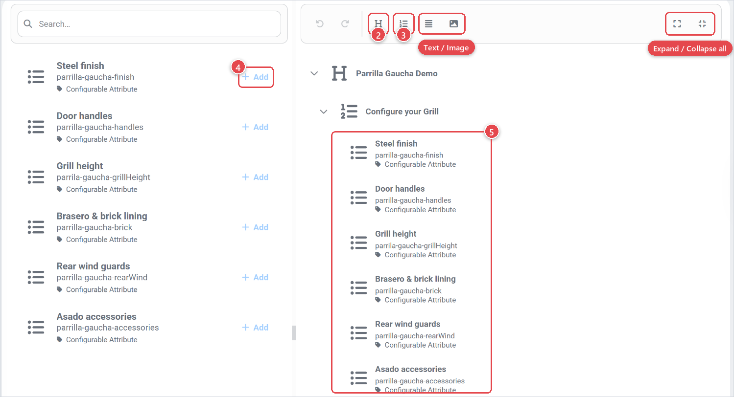
The layout saves automatically as you make changes. Use the Undo/Redo controls if you make a mistake.
Layout items
The layout builder uses a two-panel view. On the left you pick attributes to add; on the right you see and reorder the current tree.
You can add the following item types to a layout:
| Item type | Found on | What it renders |
|---|---|---|
| Section | Top-bar | A named group of steps or attributes. Sections are the top-level building block. |
| Step | Top-bar | A named sub-group inside a section. Use steps to break a long configurator into pages or accordion panels. |
| Attribute | Left-side | A single configurable attribute from the product. The configurator renders it as a dropdown, swatch, radio button, or other control depending on its display type. |
| Image | Top-bar | A static image that is always visible, regardless of attribute selections. Useful for reference images or branding. |
| Text | Top-bar | A block of static text. Supports multiple locales. Useful for instructions, legal notices, or marketing copy. |
Once you have a very large layout you can use the Expand all and Collapse all buttons on the right of the top bar. With this you can create a better oversight for yourself.
Display functions
Every attribute, section, and step node has a Display Properties sub-form that controls how the configurator renders it:
| Property | What it controls |
|---|---|
| Visibility | Whether the node is shown or hidden by default. Rules can override this at runtime (only on attributes). |
| Type | The display style: flat, vertical step, accordion, tabs, or Custom (see below). |
| Show Title | Whether the node's name is shown as a heading in the configurator. |
| Collapsed | For vertical-step type sections only: whether the step starts collapsed. |
When Type is set to Custom, a Custom Function Name field appears. Enter the name of a JavaScript function that the theme provides to handle the rendering. This is an advanced option for custom themes.
Attribute properties
When you select an Attribute node in the tree, the property panel shows Display Properties specific to that attribute:
| Property | What it controls |
|---|---|
| Visibility | Whether the attribute is shown or hidden. |
| Type | How the attribute values are presented (List, Slider, Tiles, Buttons, Dropdown, or Custom). The available types depend on the attribute's own configuration. |
| Searchable | Adds a search bar to your attribute |
| Sortable | Allows the user to sort the options either A-Z or Z-A |
| Page size | Sets the amount of options per page |
Group attributes that belong together logically into Sections even if the configurator only has one step.
Static images
An Image node lets you embed a fixed image in the layout flow. When you add an image node you can set:
- Name | used as the label in the tree (not shown to end users unless Show Title is on).
- Visibility | Whether the image is shown or hidden
- Width and Height | Can be set to either px or % of width
- Alignment | how the image aligns within its container
- Fit | how the image fills its bounding box (cover or contain)
Use static images sparingly. A product that already has a 3D visualization or a gallery does not usually need additional static images in the layout. Reserve them for instructional diagrams or mandatory legal imagery.
Static text
A Text node embeds a text block in the layout. Text content is translatable, so you can provide a different copy per locale. The text node has the same Visibility and Type display properties as other nodes.
Add important instructions in a text node directly above the attribute they relate to. Avoid long blocks of text at the start of the configurator, users tend to skip them. Short, inline tips near the relevant controls are more effective.
Deleting a layout is permanent. The Delete Layout button is in the sidebar. There is no undo for a layout deletion, use it only if you want to start from scratch.