Edit
The Edit tab is the first stop after creating a product. It covers the core setup: general properties, which attributes the product uses, the image gallery, and which visualizations (3D mappings or 2D views) are attached to the product.
General
The General section mirrors what you filled in at creation. You can update the name, identifier, SKU, status, catalog assignment, categories, and description here at any time. The Type field (Simple or Bundle) is shown but cannot be changed after the product is first saved.
A Thumbnail field appears beside the general fields. The thumbnail is used in the product list and, in some webshop themes, as the product card image. Upload a square image for the best result.
Attributes
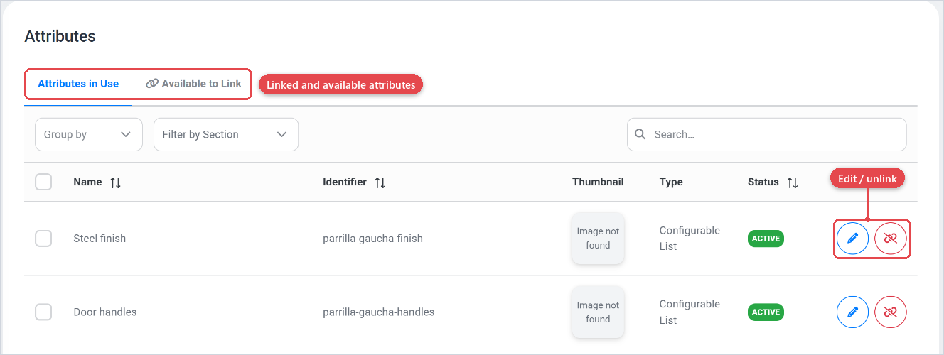
The Attributes section shows two sub-tabs:
- Attributes in Use lists the attributes already linked to this product. You can edit these attributes by clicking the blue pencil, or unlink the attribute by clicking the red button.
- Available to Link shows the all attributes from the attribute library (Attributes) that you can add to this product. Click the link button behind the attribute to link it.
For a Bundle product, this section is called Bundle Options and shows the bundle components rather than free-standing attributes.
You can link multiple attributes at the same time by clicking the checkboxes in front of the attributes, and clicking the link button at the top.
Only link the attributes a product actually needs. Unused attributes clutter the layout builder and can confuse the pricing setup. If the same attribute is shared across many products, create it once in the attribute library and link it to each product rather than duplicating it.
Gallery
The Gallery section holds the images that the configurator can display alongside or instead of a 3D/2D visualization. There is no limit on the number of images. They are shown in the order you drag them into.
For each gallery image you can:
- Set Alt text for accessibility.
- Mark one image as the Hero image (the primary display image when no visualization is active).
Provide at least one gallery image even for products with a 3D visualization. Some devices or embedding contexts fall back to static images if the 3D engine cannot load. Use the hero image as the fallback.
Visualisation mapping
The Visualizations section lists all 3D visualization mappings and 2D visualizations linked to this product. Each row shows the name, identifier, the visualization it points to, and its status.

Use Add 3D to connect a new 3D visualization mapping (Visualization mapping). This links a 3D visualization asset (created under Visualization) to this product and lets you map product attributes to 3D material groups or visibility rules (3D visualization).
This section is the connection point, the detailed mapping configuration lives on the linked visualization mapping page, not here.
2D visualisation
Use Add 2D to attach a 2D visualization (2D visualization) to this product. 2D visualizations use image layers that respond to attribute selections, suitable for products where a flat or top-down rendering is more appropriate than a 3D scene.
Like the 3D mapping, the list here is a link to the full 2D visualization configuration. Click the edit icon on any row to open the detailed setup.
A product can't have both 3D mappings and 2D visualizations active at the same time. Set the status of each to Active only when it is ready for the end user. Keep work-in-progress visualizations Inactive so they don't appear in the configurator.